We’ve all heard of the notion of dog years, right? Well, web design years are similar but more extreme. Visiting a website designed in 2017 is like walking into a bathroom with an avocado suite. Sure, it’s functional, but really?!
And what does an avocado suite say about the owner? Behind the times? Lacking vision? Not the things you want people to think about your business. That’s why it’s more important than ever to incorporate modern design into your website.
In this post, we look at five trends we see gaining momentum with web designers that we think will add a modern flair to your new site.

1. BOLD SCREEN DOMINATING FONTS
Modern web designers will experiment more with fonts in 2024. We’re seeing vintage typeface making a surprising comeback in branding. Outlined type and bold type are also showing up more, but the most prominent type trend of all is bold, screen dominating text.
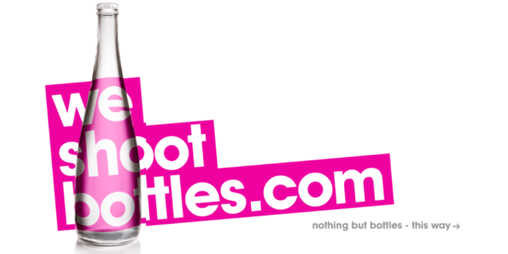
Note how We Shoot Bottles (above) uses a hugely bold font in a striking colour to leave no room for vaguery as to what they do. It gives the site a bold, chunky feel, while still coming off as professional.
We ensure that your website’s typeface matches your brand, your audience, and your industry, and choose easy-to-read fonts for the body text of our client’s sites. The readability of your text is one of the essential factors in improving your site’s user experience.
2. WHITE SPACE
Modern website design is heading back to minimalism in 2024 with a tide of purposeful white space. White space helps move visitors through your site pages, flowing from one element to the next and creating a visual hierarchy where no element distracts from the whole.
The breathing room white space provides allows viewers’ eyes to rest. It also aids comprehension by defining relationships between page elements.
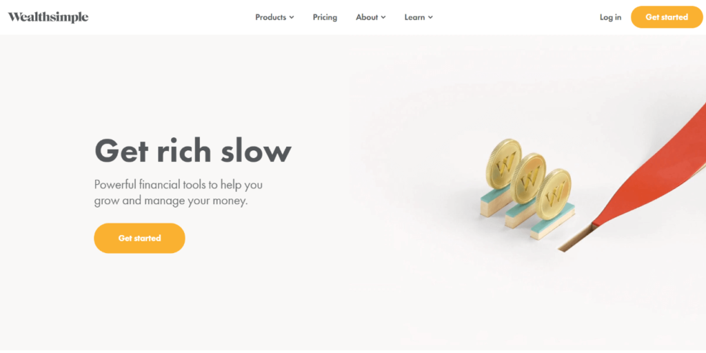
Wealthsimple’s use of white space (below) makes their page clean and definitively clear. The design matches their message – less is more,

3. COLOUR TRENDS
Much like fashion designers, website designers are always exploring colour pallets Every year there’s a new popular colour for the web.
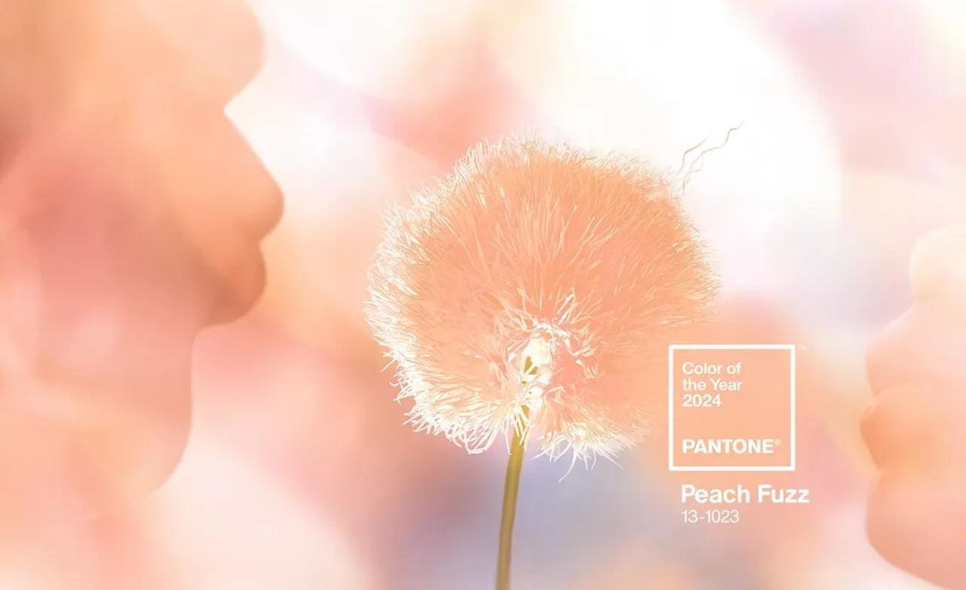
In 2022, it was veri-peri, and in 2023, viva magenta. For 2024, the colour of the year has been named Peach Fuzz, a warm peach with a hint of white.

We are seeing a broader use of more muted colours on dark modes so far in 2024, and the use of gradients that we first saw gaining popularity in 2022, looks set to continue.
4. PLAYFUL CURSERS
An interesting trend that we have been talking to clients about this year is the use of feature cursers that can add a new dimension to the viewing experience.
We can implement playful cursors on your site by simply changing the cursor shape, such as a pizza for an Italian restaurant, or through more complex coding that enables cursor-triggered animations. Either way, your visitors will have a great time engaging with unique cursors.
5. STORYTELLING
Our final trend for websites in 2024 is storytelling. A great website will shine at telling stories. Brand stories, people stories, and mission stories are becoming more and more important in achieving customer brand loyalty.
After a difficult period during the global pandemic, people are looking for brands they can believe in; brands with which they have a real affinity.


